


The dashboard has many possibilities. To help you find your way around, this page shows you how to use the dashboard, with examples of research questions. We would appreciate any questions or suggestions you may have about this dashboard.
What can you do in the dashboard?
- View water quality data: easily search for substances by name, CAS number, or via substance groups.
- Create line graphs: Visualise changes in concentrations over time and compare substances.
- Compare locations: See how concentrations of a substance evolve at different measurement points.
- Test policy goals: Analyse the water quality with our testing methods:
- ERM target values
- Removal Requirement Index (Water Framework Directive, Article 7.3)
Some examples
Example 1: a line graph of sucralose
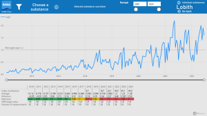
Would you like to see, for example, how the concentration of sucralose evolves? You can view this via the ‘line graphs’ tab.
- Select a location, e.g. ‘Lobith’
- Select ‘Individual substances’
- The page for the graph is empty at first, click on ‘Choose a substance’ at the top
- Search for sucralose: You can now search directly for ‘sucralose’ in the right column or search the main and subgroups in the left column. Once you have chosen a substance, click on ‘Apply selection’ in the top right to go to the graph.
The red dotted line in the graph indicates the ERM target value. The table below the graph shows the key figures by year.
Useful tips:
- Hover your mouse over a graph for the measured values.
- View the table with the underlying data by right-clicking on a graph.
- The ‘Go back’ button takes you back to the ‘Line graphs’ tab.
Example 2: a graph of several sweeteners
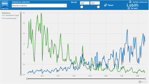
You can compare several substances at once or make all substances in a substance group visible via the ‘multiple substances’ option in the ‘line graphs’ tab.
- First select a location again, e.g. ‘Lobith’.
- Select ‘Several substances’.
- Choose which substances you want to display via the drop-down menu at the top. For example, you type in ‘sweeteners’, you will first see the main group ‘industrial pollutants and consumer products’, click it open via the arrow. You can now see ‘artificial sweeteners’, also click this group open. Select, for example, ‘Acesulfame-K’ and ‘sucralose’. You will now see the graph.
The graph shows that acesulfame-K concentrations have decreased over the years, but sucralose concentrations are increasing.
Useful tip:
- Use the ‘Reset’ button to adjust selections.
Example 3: Compare sucralose concentrations between sites
Do you want to see how sucralose concentrations evolve across sites? Then follow these steps in the ‘line graphs’ tab:
- Go to ‘Compare locations’ without selecting a specific location.
- Select the locations ‘Lobith’ and ‘Nieuwegein’ at the top.
- Click on ‘Choose a substance’ at the top right, search and select ‘sucralose’ and click on ‘Apply selection’.
The graph shows that sucralose concentrations are increasing at both locations, but the increase is faster at Nieuwegein than at Lobith.
Useful tip:
- Click on a location at the top left to highlight that line in the graph and to see key figures from that location.
Overview of ERM targets
The target values from the European River Memorandum (ERM) describe the water quality required to produce clean drinking water using natural purification techniques. These values are used by European drinking water companies that depend on river water, such as those from the rivers Rhine, Meuse and Danube. They therefore form the core of the water quality assessment for RIWA-Rijn.
How does it work?
- Choose the tab ‘ERM Target values’
- Click on ‘Annual maxima’ (selecting a location is not necessary)
- Select a reporting year
- If you want to quickly search for a substance, select a substance or subgroup at the top, e.g. ‘artificial sweeteners’
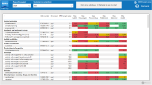
The table shows the substances that exceeded the ERM target value once or more at one or more locations in the selected year. The table shows the highest measured concentration per location. Values above the ERM target value (such as 1 µg/l for sucralose) are coloured red, values close to the ERM target value are coloured yellow.
For example, you can see that sucralose exceeded the ERM target value at all locations in 2023, and the same is true for acesulfame-K in 2014.
Removal Requirement Index
With the Removal Requirement Index, we monitor whether the goal of article 7.3 of the Water Framework Directive (WFD) is met. This article states that the level of purification treatment required for drinking water production must be reduced. The index shows whether the removal requirement is decreasing and thus whether this WFD goal is being met. However, so far we see that this is not the case in the Rhine in the Netherlands.
How is the index calculated?
The Removal Requirement Index shows how much a drinking water company has to purify in order to convert river water into drinking water. It shows the difference between the quality of the river water and the requirements for drinking water, defined in the Dutch Drinking Water Decree (DWB).
You can find more information on the methodology in the explanation on the ‘Removal Requirement Index’ tab and in the theme report ‘ Removal requirement and purification treatment effort for Dutch Rhine water from 2000-2018’
What can you do in the ‘Removal Requirement Index’ tab?
The ‘Removal Requirement Index’ tab allows you to see a number of views of the Removal Requirement Index at our reporting locations:
- The trend of the index and the total number of substances
- The contributing substance groups
- Ribbon graphs and tables of the individual contributing substances
Some examples:
Example 1: the trend of the Removal Requirement Index
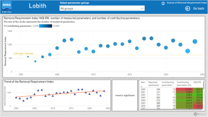
Do you want to see how the index develops at a specific location? Then follow these steps in the ‘Removal Requirement Index’ tab:
- Select a location, e.g. ‘Lobith’
- Select ‘Course of Removal Requirement Index’. The upper graph shows the development of the Removal Requirement Index since the year 2000. The lower graph shows the trend of the index.
- A significant upward trend can be seen at Lobith. So the removal requirement has increased rather than decreased over the years.
Useful tip:
- In the drop-down menu at the top, choose whether you want to see the trend of the index across all substance groups or for a specific substance group
Example 2: graph of relative contribution per substance group
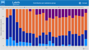
If you are interested in the relative contribution to the index per substance group per year, you can look it up as follows:
- Select a location, e.g. ‘Lobith’
- Select ‘Contribution per substance group’. The graph you see shows the relative contribution to the index per main group per year.
- For Lobith, you can see that in 2023 the substance group ‘Industrial pollutants and consumer products’ made the largest contribution to the index.
Example 3: ribbon graph of individual contributing substances to the index
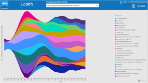
In Example 2, you were able to see which main group made the largest contribution to the index per year. Would you like to examine in more detail what the contribution was of the individual substances in this substance group? You can see this in the ribbon graphs:
- Select a location, e.g. ‘Lobith’
- Select ‘Graph of contributing substances’. You will now see a ribbon graph with all contributing substances from 2000 onwards.
- From the dropdown menu at the top, select a specific main group, for example ‘Industrial pollutants and consumer products’
- You will now see the individual contributing substances from this group in the ribbon graph. The width of each coloured ribbon represents the percentage to be removed of the respective substance.
For the ‘Industrial pollutants and consumer products’ group in Lobith, you can see that, for example, the substance EDTA has a large contribution to the Removal Requirement Index in most years. ETBE had a removal requirement from 2001 to 2010 and then the concentrations decreased again. In the last few years, you can see TFA, sucralose and HMMM, among others, appearing in the index.
Useful tip:
- If you click on a substance in the legend of the graph, it will be highlighted in the graph.
- Hover your mouse over the i-icon to the left of the graph for information on the scale of the coloured ribbons.
We hope you enjoy exploring the dashboard and our data.